Visualizer: Types, Uses, Benefits & Complete Guide
A visualizer can turn information, ideas, sounds, or designs into something people can understand by looking at it. Instead of presenting everything through plain text or numbers, a visualizer uses graphics, charts, animations, diagrams, images, or interactive elements to make information easier to explore.
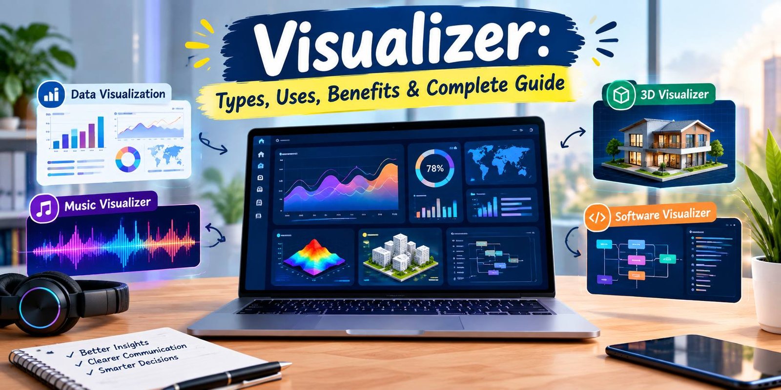
Today, visualizers are used in many areas. Businesses can use them to present data, designers can use them to preview ideas, developers can visualize software systems, and musicians can create animated visuals that respond to sound. The exact purpose depends on the type of visualizer being used.
With so many different tools available, understanding what a visualizer does can help you choose the right solution for your project. This guide explains the meaning of visualizer, common types, practical uses, benefits, limitations, and tips for selecting a suitable tool.
What Is a Visualizer?
A visualizer is a tool, application, or system that represents information or content in a visual format.
The word can describe different technologies depending on the context. For example, a data visualizer may convert numbers into charts and graphs, while a music visualizer can create animated graphics that react to audio.
The main idea is simple: information that may be difficult to understand in its original form is presented visually.
A good visualizer can help users notice:
- Patterns
- Changes
- Relationships
- Trends
- Differences
- Important details
- Complex connections
Visualization can make complicated information easier to explore because people can often recognize visual patterns faster than they can interpret large blocks of raw information.
How Does a Visualizer Work?
The exact process depends on the type of visualizer, but most tools follow a similar basic workflow.
Input Is Added
The first step is usually providing information to the tool.
Depending on the software, the input might include:
- Numbers
- Spreadsheet data
- Text
- Images
- Audio
- Video
- 3D models
- Software information
- Measurements
- Business statistics
The Information Is Processed
The visualizer then organizes or analyzes the input according to its purpose.
For example, a data visualization tool may organize numerical values into categories. A music visualizer may analyze characteristics of an audio signal to create changing graphical effects.
A Visual Representation Is Created
After processing the input, the tool produces a visual result.
This could be a:
- Chart
- Graph
- Dashboard
- Diagram
- Animation
- Interactive graphic
- 3D model
- Audio-reactive display
- Software diagram
Users Explore the Result
Some visualizers provide interactive controls. Users may be able to zoom, filter, rotate, change colors, select categories, or adjust other settings.
Interactive visualization can be particularly useful when a large amount of information needs to be explored.
Main Types of Visualizers
The term visualizer covers several different categories. Knowing the difference can make it easier to select an appropriate tool.
Data Visualizer
A data visualizer converts raw information into visual representations.
Common examples include:
- Bar charts
- Line graphs
- Pie charts
- Scatter plots
- Maps
- Heat maps
- Dashboards
Data visualizers are useful when large amounts of information need to be examined or communicated.
For example, a business could use a visualizer to display monthly sales. Instead of reading dozens of individual numbers, users could examine a chart showing how sales changed over time.
Music Visualizer
A music visualizer creates animated graphics based on audio.
These visuals may change according to characteristics of the music, such as rhythm, volume, or frequency.
Music visualizers are commonly used for:
- YouTube videos
- Music releases
- Social media content
- Live performances
- Promotional videos
- Background visuals
A music visualizer can give an audio track a stronger visual identity without requiring a traditional music video.
3D Visualizer
A 3D visualizer presents objects, spaces, or concepts in three dimensions.
These tools can be useful for:
- Architecture
- Interior design
- Product design
- Engineering
- Real estate
- Manufacturing
- Gaming
- Creative projects
A 3D visualizer may allow users to rotate an object, inspect different angles, change materials, or preview a design before it is physically produced.
Image Visualizer
An image visualizer focuses on presenting images or visual content in an organized way.
Depending on the application, it may offer:
- Image previews
- Galleries
- Zoom controls
- Comparisons
- Filters
- Layout options
- Presentation modes
These tools can be useful for photographers, designers, marketers, and other creative professionals.
Software Visualizer
A software visualizer represents parts of a software system graphically.
Software visualization can help people understand program structure, behavior, data relationships, and development information. IEEE describes software visualization as a way of graphically representing software artifacts and their structure, behavior, or evolution.
Possible visual elements include:
- Code relationships
- Architecture diagrams
- Data flows
- Dependency graphs
- Algorithm animations
- System structures
This can be especially useful when a software project becomes too complex to understand easily from source code alone.
Online Visualizer
An online visualizer works through a web browser instead of requiring traditional desktop installation.
This can be convenient for users who want to create or explore visual content from different devices.
Online visualizers may support tasks such as:
- Data visualization
- Graphic creation
- 3D previews
- Audio visualization
- Presentations
- Interactive dashboards
Before uploading sensitive information to an online service, users should review its privacy and data-handling practices.
Why Are Visualizers Useful?
A visualizer can make information easier to understand by giving it a visual structure.
They Simplify Complex Information
Large datasets can be difficult to read when presented only as tables.
A suitable chart or graphic can provide a quick overview while still allowing users to investigate important details.
They Make Patterns Easier to Notice
Visual representations can reveal trends that may not be obvious in raw information.
For example, a line chart can make a rising or falling trend immediately noticeable.
They Improve Presentations
Visual content can make presentations more engaging and easier to follow.
Instead of displaying a page filled with numbers, a presenter can use charts, diagrams, or interactive graphics to communicate the same idea more clearly.
They Support Better Exploration
Interactive visualizers allow users to examine information from different perspectives.
Filters, zoom controls, categories, and other features can make exploration more flexible.
They Save Time
When a tool presents information clearly, users may spend less time manually comparing individual values.
However, the visualizer still needs to be configured correctly. A poorly designed visualization can make information more confusing rather than clearer.
Common Uses of Visualizer Tools
Visualizer technology appears in many industries and everyday applications.
Business
Companies can use visualizers for:
- Sales reports
- Marketing performance
- Financial information
- Customer data
- Website analytics
- Business dashboards
Visual reports can help teams communicate important information during meetings and planning sessions.
Education
Teachers and students can use visualizers to explain difficult concepts.
Examples include:
- Scientific diagrams
- Interactive maps
- Mathematical graphs
- Historical timelines
- Educational animations
Visual learning tools can provide another way to understand information beyond written explanations.
Design
Designers can use visualizers to preview ideas before creating final products.
For example, a designer might visualize a room, product, logo, package, or digital interface.
Marketing
Marketers often need visual content to communicate information quickly.
Visualizer tools can help create:
- Charts
- Infographics
- Product previews
- Social media graphics
- Campaign reports
Entertainment
Music and video creators can use visualizers to add movement and graphical effects to audio or video projects.
Technology
Technology teams can use visualization to understand systems, performance information, software structures, and relationships between components.
Benefits of Using a Visualizer
Using the right visualizer can provide several advantages.
Easier Communication
A visual representation can help explain an idea without requiring a long written explanation.
Better Data Understanding
Charts and graphs can make relationships between values easier to recognize.
More Engaging Content
Animations, interactive graphics, and attractive dashboards can make digital content more engaging.
Faster Comparison
Visual elements can make it easier to compare categories, time periods, products, or other groups.
Flexible Presentation
Many modern visualization tools allow users to change the way information is displayed.
This means the same underlying information can potentially be presented through different charts or layouts.
Limitations of Visualizers
Visualizers are useful, but they are not automatically accurate or effective.
Poor Design Can Mislead
A badly designed chart may exaggerate differences or hide important information.
The visual presentation should match the information being communicated.
Large Data Can Become Overwhelming
Adding too many elements to a dashboard or chart can make it difficult to understand.
More graphics do not always mean better communication.
Some Tools Have a Learning Curve
Advanced visualization software can include many settings and features.
Beginners may need time to understand how the interface and visualization options work.
Some Features May Require Payment
Basic visualization features may be available for free, while advanced functions can require a subscription or paid software.
Online Tools Can Raise Privacy Questions
If a visualizer requires uploading business files, personal information, images, or other sensitive content, users should understand how that information is stored and handled.
How to Choose the Right Visualizer
Choosing a visualizer becomes easier when you start with the goal rather than the software name.
Define Your Purpose
First ask what you want to visualize.
Do you need to show:
- Data?
- Music?
- A product?
- A building?
- Software?
- Images?
- A presentation?
Your answer will narrow down the appropriate category.
Check Supported Input
Make sure the tool accepts your data or content format.
For example, a data visualizer may support spreadsheets or databases, while another tool may focus on audio or 3D models.
Look at Export Options
Check whether the tool can export the final result in the format you need.
Depending on your project, you might need:
- PNG
- JPG
- SVG
- Video
- Presentation files
- Interactive web content
Consider Ease of Use
A powerful tool is not always the most practical choice.
If you only need a simple chart, a complicated professional platform may create unnecessary work.
Review Customization
If appearance matters, check whether the visualizer allows you to customize:
- Fonts
- Layouts
- Labels
- Colors
- Charts
- Animation
- Branding
Check Privacy and Security
For sensitive projects, privacy should be part of the selection process.
Read the provider’s privacy information and understand what happens to uploaded files and account information.
Visualizer vs Traditional Presentation
A traditional presentation may rely heavily on text and static images. A visualizer can add dynamic or interactive elements.
For example, instead of showing a table containing monthly sales figures, a presentation could use a chart that highlights changes over time.
This does not mean visualizers should replace text completely. Text, numbers, labels, and explanations are still important because they provide context.
The strongest result often comes from combining clear writing with an appropriate visual representation.
Tips for Creating Better Visualizations
Keep the Main Message Clear
Every visualization should have a purpose.
Before adding design elements, determine what the viewer should understand from the graphic.
Avoid Unnecessary Details
Too many labels, colors, icons, and animations can distract from the main information.
Use Appropriate Charts
Choose a visualization format that matches the information.
For example, a line chart may be useful for showing change over time, while a bar chart may be suitable for comparing categories.
Label Important Information
A viewer should not have to guess what a number, line, or category represents.
Clear titles and labels can improve understanding.
Make the Design Readable
Use enough contrast, spacing, and appropriately sized text so the visualization remains easy to read.
Test Before Publishing
Review the final visualization on the device where your audience will see it.
A design that looks good on a large monitor may not work as well on a small screen.
Are Visualizers Only for Professionals?
No. Many visualization tasks can be completed by beginners.
Simple tools may provide templates, drag-and-drop interfaces, and automated chart creation. More advanced platforms offer additional control for professional users.
The important factor is matching the tool to the task.
A beginner creating a simple chart does not necessarily need professional visualization software. Similarly, a large organization working with complex datasets may need more advanced features.
Frequently Asked Questions
What is a visualizer?
A visualizer is a tool or system that presents information, data, sounds, designs, or other content through visual elements such as graphics, charts, diagrams, animations, or interactive displays.
What is a visualizer used for?
A visualizer can be used for data analysis, presentations, design previews, software understanding, music graphics, education, marketing, and many other tasks.
Is a visualizer the same as a visualization tool?
The terms can overlap. A visualization tool is generally software used to create or explore visual representations, while “visualizer” can describe the tool itself or a feature that generates visual content.
What is a data visualizer?
A data visualizer converts information into visual formats such as charts, graphs, maps, and dashboards to make patterns and relationships easier to understand.
What is a music visualizer?
A music visualizer creates animated graphics or effects that respond to audio characteristics, allowing music to be presented with a visual component.
Can beginners use visualizer tools?
Yes. Many tools are designed with beginner-friendly interfaces. The difficulty depends on the type and complexity of the visualization.
Are online visualizers safe?
Safety depends on the specific service. Before uploading sensitive information, check its privacy policy, security practices, storage rules, and data-handling terms.
Can visualizers work with large datasets?
Some advanced visualization platforms are designed to handle large datasets, but performance depends on the software, data source, hardware, and visualization complexity.
Does a visualizer replace written information?
Not always. Visualizations work best when they are supported by useful labels, explanations, and context.
Final Thoughts
A visualizer is a broad type of tool that can transform information or creative content into a visual experience. From data charts and business dashboards to music animations, 3D previews, and software diagrams, visualizers can serve very different purposes.
The best choice depends on what you need to communicate. Start by identifying your goal, then consider the required input format, features, customization, export options, ease of use, and privacy.
A good visualization should not simply look attractive. It should help the viewer understand something more easily. When the design, information, and purpose work together, a visualizer can turn complicated material into a clearer and more useful experience.